






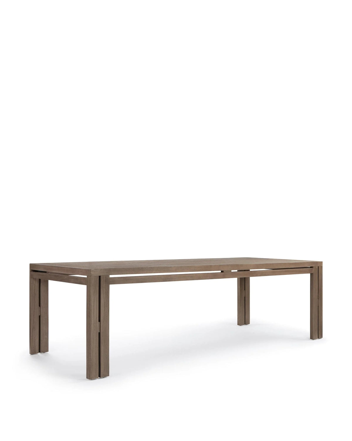
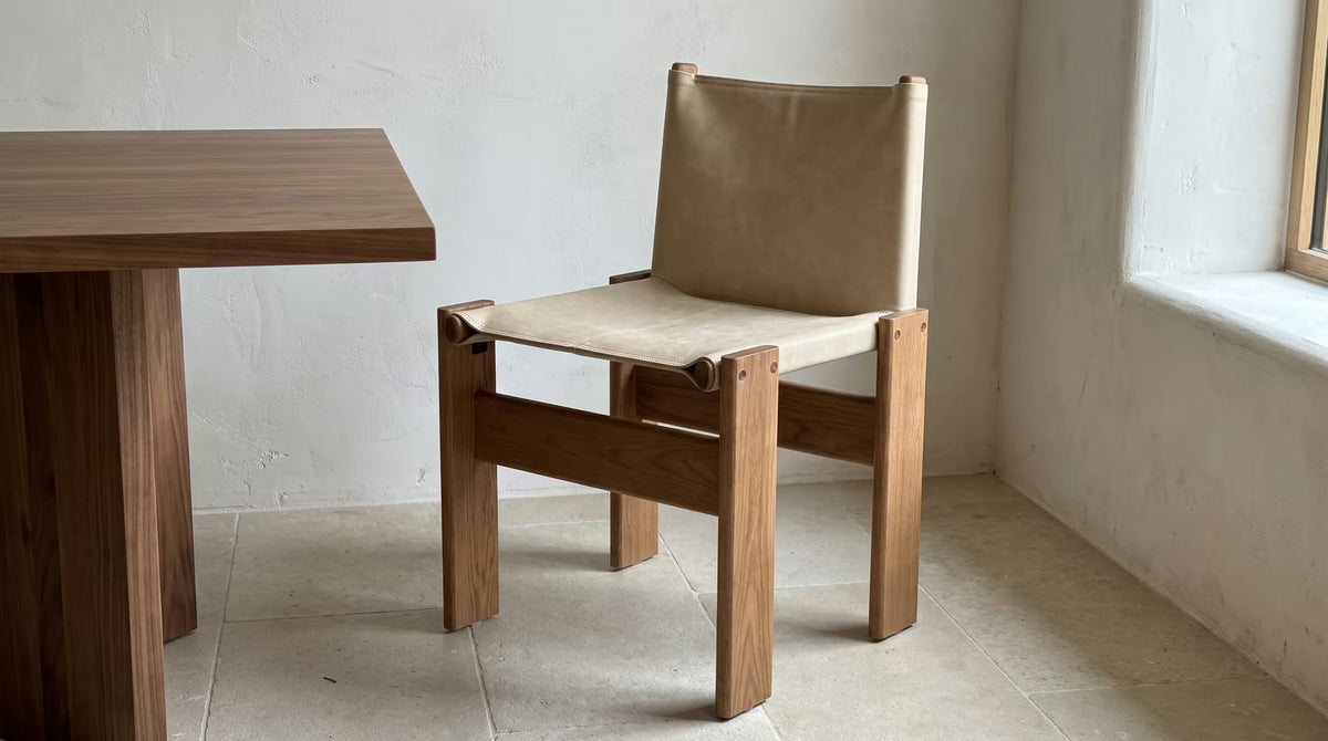
Why Two Walnut Finishes Can Look Different in the Same Room

Written by Charlotte Bruno
Design Editor at Madorne
Two pieces sold with a “walnut” finish can look different beside one another. The word may identify a wood species, a stain color or a general visual tone. Surface sheen, grain, nearby colors and lighting can then change how the finish appears in the room.
Start by separating the substrate from its treatment. Then compare real samples in the intended position. A shared finish name is useful for browsing, but it is not a promise of identical color or grain.
Ask what the walnut label identifies
“Solid walnut” identifies a timber species and construction claim. “Walnut-stained ash” identifies ash with a walnut-colored treatment. “Walnut finish” may leave the underlying wood unspecified. These descriptions should not be treated as interchangeable.
Read the frame material and finish together. If the product uses veneer or laminated construction, ask which material forms the visible surface and which forms the support. A dark brown color is not proof of a walnut substrate.

Use the current listing rather than the reference design
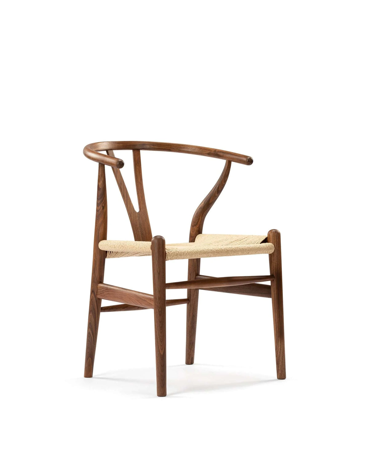
The Monko 73 dining chair lists solid wood with a walnut-oiled finish. That description does not identify the wood species precisely enough to assume solid walnut. Request clarification if the substrate matters to your decision.
The material of a historical design reference does not automatically fill a gap in a current independently made product’s specification.
Compare a stained substrate with a different finish
The Axen dining armchair explicitly lists ash with an oiled walnut stain. It provides a useful contrast with a more general walnut-finish description. The appearance can belong to a brown-toned treatment while the wood beneath it remains ash.

When coordinating the two, compare the visible surfaces rather than insisting the names prove a match. One may have different grain character, undertone or sheen. That difference can be intentional and attractive if it is understood before ordering.
Do not infer the finish across every variant
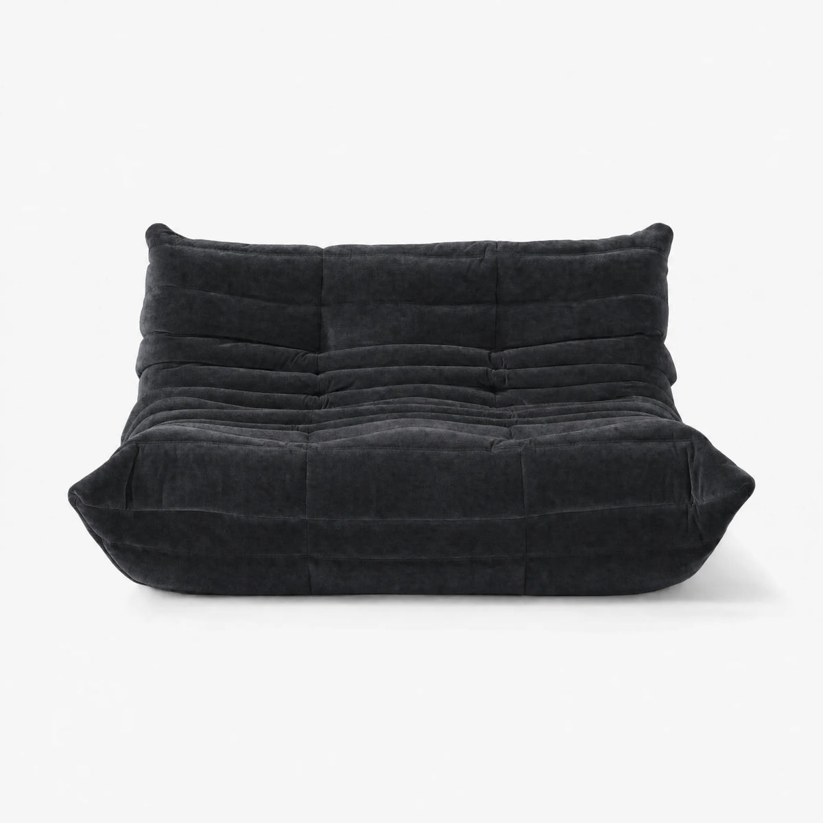
A product may offer several upholstery or timber options. Check which specification belongs to the selected variant. A description of a verified black-upholstered variant does not necessarily establish the finish of every other color in the same gallery.
Look at undertone, grain and sheen separately
Start with the overall tone: does the finish appear more reddish, yellow-brown or neutral brown beside the floor and table? Then look at the grain’s visibility and scale. Finally, examine whether the surface appears matte, satin or more reflective.
These separate observations explain why two similarly dark objects can still look unlike. A strong sheen can catch the window, while a quieter surface keeps its color more consistent from one viewing angle.
Compare the relationship, not a phone-screen match
Put samples beside each other and beside the room’s other materials. A screen image can be affected by the lighting of the photograph and your display. It is a reference for appearance, not a calibrated guarantee of the delivered finish.
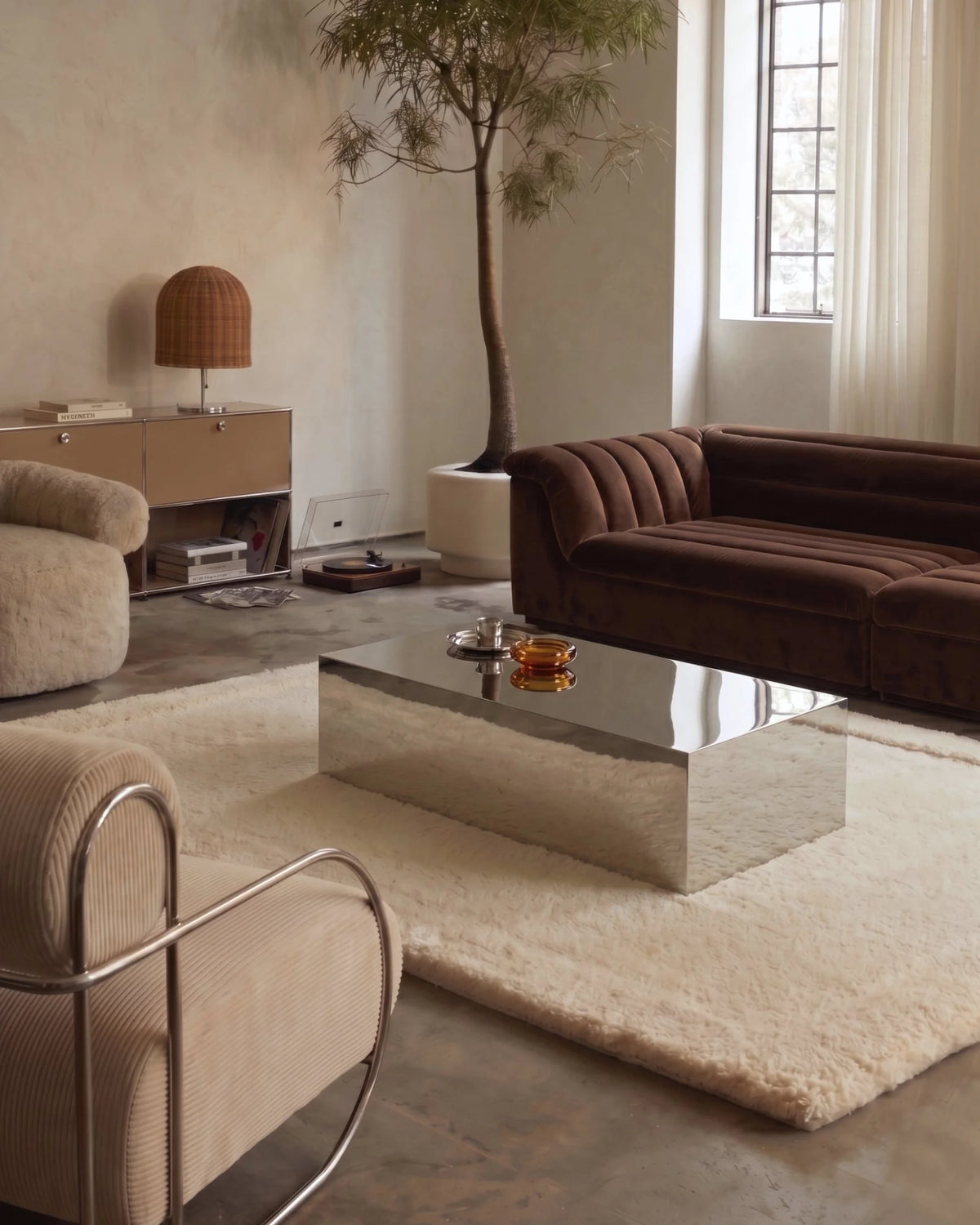
If samples are unavailable, request clear images of the actual selected finishes in neutral light and ask what variation is expected. Do not rely on one heavily styled lifestyle image.
Check the finish through the day
Place the samples where the furniture will stand, not only on a bright desk near a window. Compare them in daylight, then under the lamps used in the evening. Turn reflective samples gently to see how their appearance changes with angle.
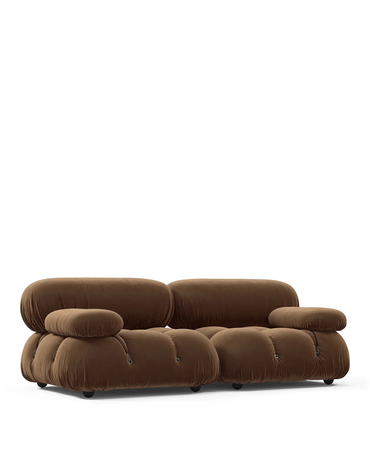
Keep the neighboring upholstery in the comparison. A beige seat can make a brown frame read differently from the same frame beside black or oxblood. The room’s surfaces form a relationship; no finish appears in isolation.
Separate lighting differences from actual material differences
If one photograph looks much warmer, do not immediately conclude that the wood is a different stain. Compare images made in similar conditions where possible. Conversely, do not blame every difference on lighting when the specification identifies different materials.
Choose deliberate coordination rather than an invisible match
A room can use one dominant wood tone and another as a controlled contrast. Repeat an undertone, surface character or material relationship rather than requiring every grain to be identical. A dark table and slightly lighter chair can create a clear composition.
Matching is still a reasonable preference. If a near-identical finish matters, ask what the supplier can actually confirm and whether pieces from separate production may vary. A finish name alone should not be presented as that confirmation.
Keep chair function ahead of timber coordination
A chair that matches the table’s tone still needs suitable seat and arm geometry. Our dining armchair clearance checklist checks the underside, opening and tucked position separately.
Likewise, a lounge chair should not be added to a dining set because its shell looks like the right walnut. Coordinate roles and dimensions before fine-tuning the finish.
Care for the actual surface treatment
Oil, lacquer, paint and other treatments need their own maintenance instructions. Do not apply wood oil on a universal schedule or assume a walnut-colored surface is oil-finished. Ask for the care guidance for the selected product.
If a finish changes unexpectedly, record the light exposure, contact and products used before seeking advice. Do not sand or recolor a piece to force a match without appropriate guidance.
For a broader discussion of substrate and surface, our leather and wood veneer specification guide explains why visible material and supporting construction should be read separately.
Make a finish comparison sheet
Record the stated wood, construction, treatment, selected variant and sample observations in daytime and evening light. Note what remains unspecified. This makes it easier to ask a precise question instead of requesting a vague “walnut match.”
When exploring wood-framed dining chairs, compare these details alongside the table fit. A thoughtful material relationship is more dependable than assuming a shared color name creates a complete set.
Walnut finish questions
Does walnut-stained ash mean solid walnut?
No. It identifies an ash substrate with a walnut-colored treatment.
Can two walnut finishes still coordinate?
Yes. Compare their undertones, sheen and grain in the actual room. Coordination does not require an invisible match.
Can a photo guarantee the delivered color?
No. Photography, display and expected material variation matter. Ask for samples or specific finish information.
What should I confirm before maintaining the surface?
The actual treatment and its approved care method. A wood-color label is not a maintenance instruction.
Read more
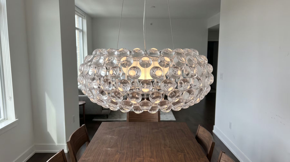
Compare fixture footprint, visual volume and seated sightlines after settling the table’s practical position.
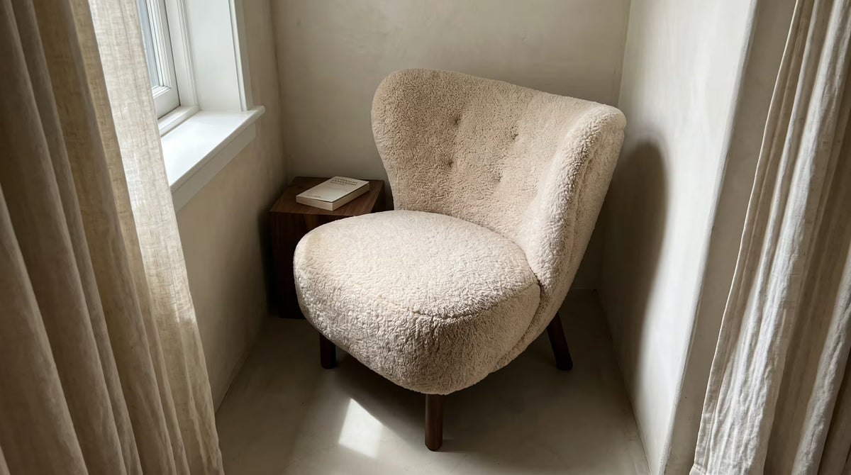
Understand what plush upholstery names tell you—and which composition, care and variant details still need confirmation.